03/12/2020 – Corona influences color trends — auf Deutsch lesen
Archroma: Trend in warm earthy color tones
The quarterly trends in the orders of the color standards and recipes seems to indicate a growing fondness among consumers for earth tones.
Page 1 of Archroma’s ‘Top 10 Neutral Colors Trending Now’ showing a strong trend in warm earthy color tones in recent pandemic-hit months. © Archroma
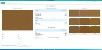
Screen capture of Color #212-820, one of the colors listed in Archroma’s ‘Top 10 Neutral Colors Trending Now’ showing a strong trend in warm earthy color tones in recent pandemic-hit months. © Archroma
The recent trend in colors is revealed by the most commonly ordered color standards and recipe from the Archroma Color Atlas library, indicating a strong shift in home textiles, apparel and fashion towards warm earthy tones.
Archroma launched the Color Atlas by Archroma in 2016, a unique tool dedicated to providing fashion designers and stylists with off-the-shelf color inspiration that can be implemented in production with just a few clicks.
Today, the Color Atlas by Archroma contains 4,320 colors applicable on cotton poplin, almost double compared to similar tools available to textile and fashion specialists, with options for purer ingredients and lighter resource usage for brands exploring more sustainable collections.
Engineered Color Standards empowered by NFC technology, as well as worldwide technical support, ensure seamless color management from the color selection to its implementation in production.
Earth tones on the rise
The colors listed in Archroma’s ‘Top 10 Neutral Colors Trending Now’ are showing a longing for even much warmer tones in the recent months since the outbreak of the pandemic that has forced large parts of the population to stay at home – or at least work from home and drastically reduce their social life and interactions.
Interestingly, in its trend forecasts for 2020/2021 which were devised two years before the Covid-19 crisis, creative trend agency Carlin had already anticipated the growing need of individuals to refocus on what brings meaning to their lives.
Carlin’s ‘Land’ trend described the growing concerns related to sustainability, the desire to reconnect with wilderness, the search for authenticity, and even the expression of more sobriety in consumption.
Archroma correlates this trend to the growing success of its EarthColors range of biomass-based dyes synthesized from wastes of the herbal or agricultural industries, such as almond husks, rosemary leaves or beetroot peels. EarthColors have seen an uptake on the market in the past year with a strong interest not only from fashion or denim brands but also from brands in the area of home décor with bedlinen collections in particular.
As people have been wearing more comfortable clothes at home during the past few months, the company has also seen more demand for the quieter tones among its range of Foron dyes than the usual bright colors in sportswear and athleisure.
Archroma anticipates that some of its solution systems supporting the consumers’ longing for more natural and calming tones will be in high demand in the coming months, in particular Color Caress, a nylon dyeing system for nude tones on bodywear and lingerie, or the upcoming ‘Casual x Smart’ system especially developed for elegant wash-down effects for versatile work-to-office casual wear.
Edouard Keller, Head of International Sales at Carlin:
“This warm and comforting color trend is now strengthening, as the impact of confinement on urban dwellers catalyzed their desire to return to the land. Whether fantasized or real, aspirations to reconnect with nature and healthier lifestyles spread and influence the attraction for less ostentatious colors that carry meaning.”
Chris Hipps, Director of the Archroma Color Management business:
“Colors are well known for their influence on our mood. Many people around the globe have been reevaluating their priorities in the context of the Covid-19 pandemic, and earthy tones have that capacity to bring us a warm comforting feeling among the anxieties and uncertainties that surround us. The Color Atlas color standards that have been ordered in the past quarter give us a very precise snapshot of the current mood around the globe, and that mood is in need of warm comforting colors at home and on us. Because it’s our nature.”