19/10/2016 – Pantone — auf Deutsch lesen
The trend colours Spring 2017
A mixture of vitality, relaxation and the great outdoors - the Pantone Fashion Colours Spring 2017.
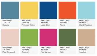
The top 10 trend colours designers use in their upcoming collections (Photo: Pantone)
In conjunction with the New York Fashion Week, the Pantone Fashion Color Report Spring 2017 was published by the colour experts at the Pantone Color Institute. The top 10 trend colours designers use in their upcoming collections are inspired by nature.
A renewed sense of imagination
“One of the things that we saw this year, was a renewed sense of imagination in which colour was appearing in context that was different than the traditional,” said Leatrice Eiseman, Executive Director of the Pantone Color Institute. “Reminiscent of the hues that surround us in nature, our Spring 2017 Fashion Color Report evokes a spectrum of emotion and feeling."
Leading as the most prevalent colour for spring 2017 is Pantone 17-4123 Niagara, a classic denim-like blue that speaks to our desire for ease and relaxation. Standing opposite is the red-based orange Pantone 17-1462 Flame, a flamboyant and vivacious shade that adds fiery heat and vitality to the spring 2017 palette.
Both the green shades Pantone 15-0343 Greenery and Pantone 18-0107 Kale show a deep connection to nature and united with the light brown Pantone 14-1315 Hazelnut they express a natural down-to-earth sensation.
“The designers applied colour in playful, yet thoughtful and precise combinations to fully capture the promises, hope and transformation that we yearn for each Spring”, said Eiseman.
The top colours for spring fashion 2017
17-4123 Niagara
13-0755 Primrose Yellow
19-4045 Lapis Blue
17-1462 Flame
14-4620 Island Paradise
13-1404 Pale Dogwood
15-0343 Greenery
17-2034 Pink Yarrow
18-0107 Kale
14-1315 Hazelnut